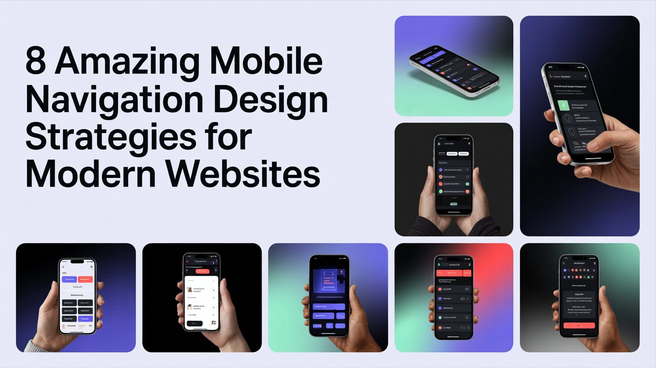
8 Amazing Mobile Navigation Design Strategies for Modern Websites
Mobile navigation is very important because many people use phones to visit websites. Good navigation helps people find what they need and do what they want easily. Bad navigation can make people leave the website quickly and not buy anything.
Websites on phones need to look good, work well, and be easy for everyone to use. How people move around a website on their phone can make it successful. This article talks about eight ways to make mobile navigation better.
- Make Menus Simple
It’s best to have simple menus. Too many choices can confuse people. Focus on the most important pages and group similar items together. Having only a few main menu items helps people find things faster. For example, a menu might just have “Home,” “About,” “Services,” “Contact.” More options can be shown when needed. - Use Hamburger Menus Carefully
Hamburger menus (the three lines) are popular because they hide extra options. This keeps the screen clean. To make them work well:-
- Make the menu icon easy to see.
- Use clear words and pictures for the options inside.
- Make them open and close quickly. When used with other navigation, hamburger menus help keep the layout tidy and let people explore.
-
- Keep Navigation Bars Visible
Sticky navigation bars stay at the top or bottom of the screen as you scroll. This means people can always see important links without scrolling back up. These bars can have main links, a search button, and a call to action. They should be visible but not block the content.
- Design for Touchscreens
Mobile users use their fingers, so buttons and links need to be large enough to tap easily. Small or close-together items can lead to mistakes and frustration. Good touch design includes:
- Properly sized buttons
- Enough space between tappable items
- Clear signs when you tap something
Making your website touch-friendly makes it easier to use and reduces navigation errors.
- Add a Search Bar
Search bars are very important for mobile, especially on sites with lots of content. People often prefer typing to scrolling through menus. A good search feature includes:
- A visible search icon at the top
- Helpful suggestions as you type
- Ways to filter or sort results
A search bar makes your site more accessible and helps users find information quickly.
- Use Icons and Visuals for Navigation
Icons help users quickly understand what different parts of the site do. Visual navigation relies less on text, making it more intuitive. For example, a shopping cart icon for buying or a magnifying glass for searching. Consistent icons and clear labels make your website like a profile design company in Dubai easier for new visitors to understand.
- Use Gesture Controls
Gestures like swiping, tapping, and pinching can make navigating on mobile feel smooth and natural. Many mobile apps use gestures to move between sections, show more content, or open menus. When using gestures:
- Show users where they can interact
- Don’t use gestures that are too complicated or overlap
- Make sure gestures work smoothly and quickly
Gesture navigation can make websites feel modern and more engaging, especially for younger users.
8. Make Navigation Fast and Easy to Use
It’s important for menus to load quickly and respond well on phones. If menus are slow, people get annoyed and leave the website. To make navigation faster:
- Don’t use big files or complicated code in menus.
- Make sure menus look good on all screen sizes.
- Check how menus work on different phones and web browsers.
Good navigation makes it easy and pleasant for people to use your website, which keeps them there longer and helps them do what you want them to do.
Conclusion: Smart Design and Creative Touches
Making good navigation for phones means thinking about how easy it is to use, how fast it is, and how it looks. Simple menus, menus that stay on screen, search bars, and designs made for touching all help people have a good experience. Adding visual touches, using gestures, and making sure it’s fast also make navigation better.
Companies that want to do better online can get help from experts. Business card services can work with website design to create a consistent brand look everywhere, both online and in person.
By using these ideas, websites can have navigation that is smooth, easy to understand, and interesting, meeting what people expect and encouraging them to interact.